集间设计 | 倚白
户型三室
面积89m²
花费30~50万
位置成都市
风格 现代、日式、侘寂、自然风、原木
前言
住宅的规模被缩小,而生活的张扬与奢侈渐渐凝缩起来,所有的答案都指向了精巧而简约这两个词语。此套案例是老客户二套房,房屋面积89m²,承重结构多。女主人是韩国人,男主人有在多国的生活经历,希望有做简餐、料理、咖啡、茶艺的空间,现在的家庭成员是夫妻二人、预留小孩房。他们希望自己的家是身体与灵魂的栖息地,空间的色调和饰品点到即止,将更多的留白留给时光…
The scale of the house has been reduced, and the publicity and luxury of life have gradually condensed. All the answers point to the two words of sophistication and simplicity. This case is the second suite of an old customer, with a house area of 89m² and a lot of load-bearing structures. The hostess is Korean, and the male host has lived in many countries and hopes to have space for simple meals, cooking, coffee, and tea. Now the family members are husband and wife, and the children's room is reserved. They hope that their home is the habitat of the body and soul, and the colors and accessories of the space will stop at the end, leaving more blank space for time...
The scale of the house has been reduced, and the publicity and luxury of life have gradually condensed. All the answers point to the two words of sophistication and simplicity. This case is the second suite of an old customer, with a house area of 89m² and a lot of load-bearing structures. The hostess is Korean, and the male host has lived in many countries and hopes to have space for simple meals, cooking, coffee, and tea. Now the family members are husband and wife, and the children's room is reserved. They hope that their home is the habitat of the body and soul, and the colors and accessories of the space will stop at the end, leaving more blank space for time...
· 户型图
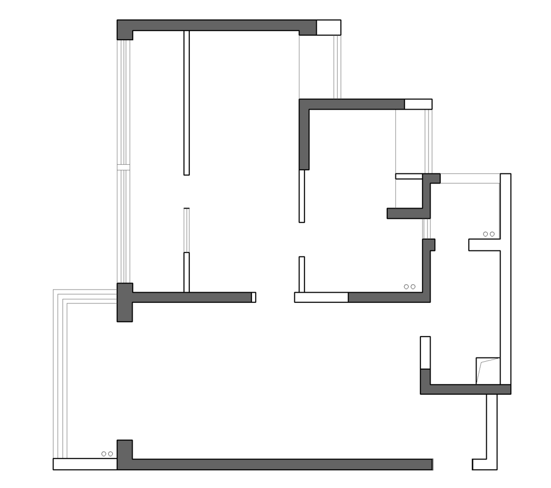

设计重点:
◾ 取消客厅阳台门,扩大客厅空间。
◾ 厨房冰箱外移,做电器操作台面与餐厅岛台连接。
◾ 餐厅增加餐边柜,结合墙体位置放置冰箱不占用餐厅空间。
◾ 把生活阳台门换成双推门,墙体变薄的同时节省开门空间。
◾ 卫生间做干湿分区,减少使用拥堵,扩大过道视野。
◾ 取消客厅阳台门,扩大客厅空间。
◾ 厨房冰箱外移,做电器操作台面与餐厅岛台连接。
◾ 餐厅增加餐边柜,结合墙体位置放置冰箱不占用餐厅空间。
◾ 把生活阳台门换成双推门,墙体变薄的同时节省开门空间。
◾ 卫生间做干湿分区,减少使用拥堵,扩大过道视野。
· 门厅

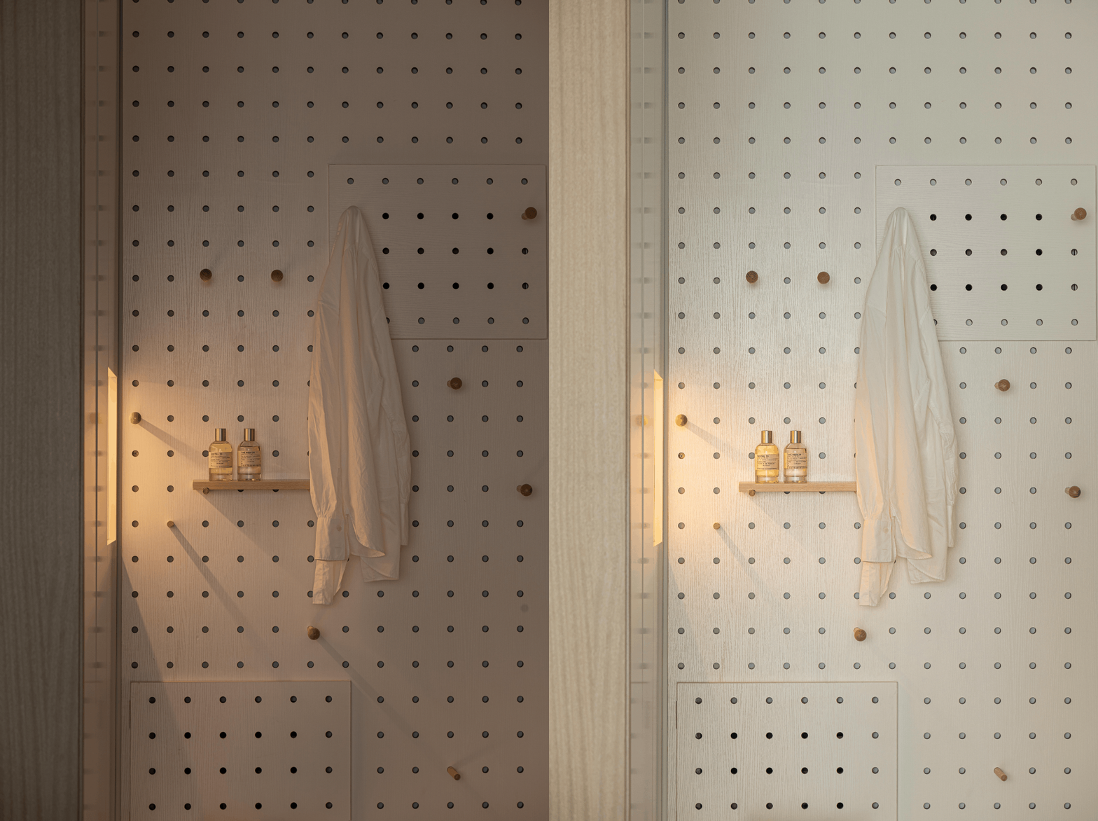
入户我们做了下沉式玄关,减少尘埃进入,增加回家仪式感。鞋柜我们加了灯带,打开门就能感受到家的温暖氛围。开门的第一眼被眼前的一束光治愈,右侧的洞洞板承载自由组合的收纳功能。配电箱盖用洞洞板制做,让墙面完整、美观。
When entering the house, we made a sunken entrance to reduce the entry of dust and increase the sense of ritual of returning home. We added light strips to the shoe cabinet, and when you open the door, you can feel the warm atmosphere of home. The first sight of opening the door is healed by a beam of light in front of you, and the perforated board on the right carries the storage function of free combination. The cover of the distribution box is made of perforated board, so that the wall is complete and beautiful.
When entering the house, we made a sunken entrance to reduce the entry of dust and increase the sense of ritual of returning home. We added light strips to the shoe cabinet, and when you open the door, you can feel the warm atmosphere of home. The first sight of opening the door is healed by a beam of light in front of you, and the perforated board on the right carries the storage function of free combination. The cover of the distribution box is made of perforated board, so that the wall is complete and beautiful.
· 餐厅


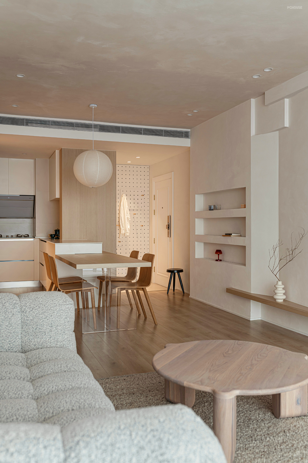
利用卫生间墙体嵌入冰箱与整个餐边柜齐平,满足收纳又不占用过道空间。岛台可做备餐区也有延伸餐厅功能,餐桌采用定制的方式,亚克力做支撑让餐厅看起来更轻盈。餐厅选用圆形吊灯,材质与整体呼应,营造温馨的用餐环境。
Using the bathroom wall to embed the refrigerator to be flush with the entire sideboard, which satisfies storage without occupying aisle space. The island can be used as a meal preparation area and also has the function of extending the restaurant. The dining table is customized, and acrylic is used as a support to make the restaurant look lighter. The restaurant uses circular chandeliers, and the material echoes the whole, creating a warm dining environment.
Using the bathroom wall to embed the refrigerator to be flush with the entire sideboard, which satisfies storage without occupying aisle space. The island can be used as a meal preparation area and also has the function of extending the restaurant. The dining table is customized, and acrylic is used as a support to make the restaurant look lighter. The restaurant uses circular chandeliers, and the material echoes the whole, creating a warm dining environment.
· 客厅
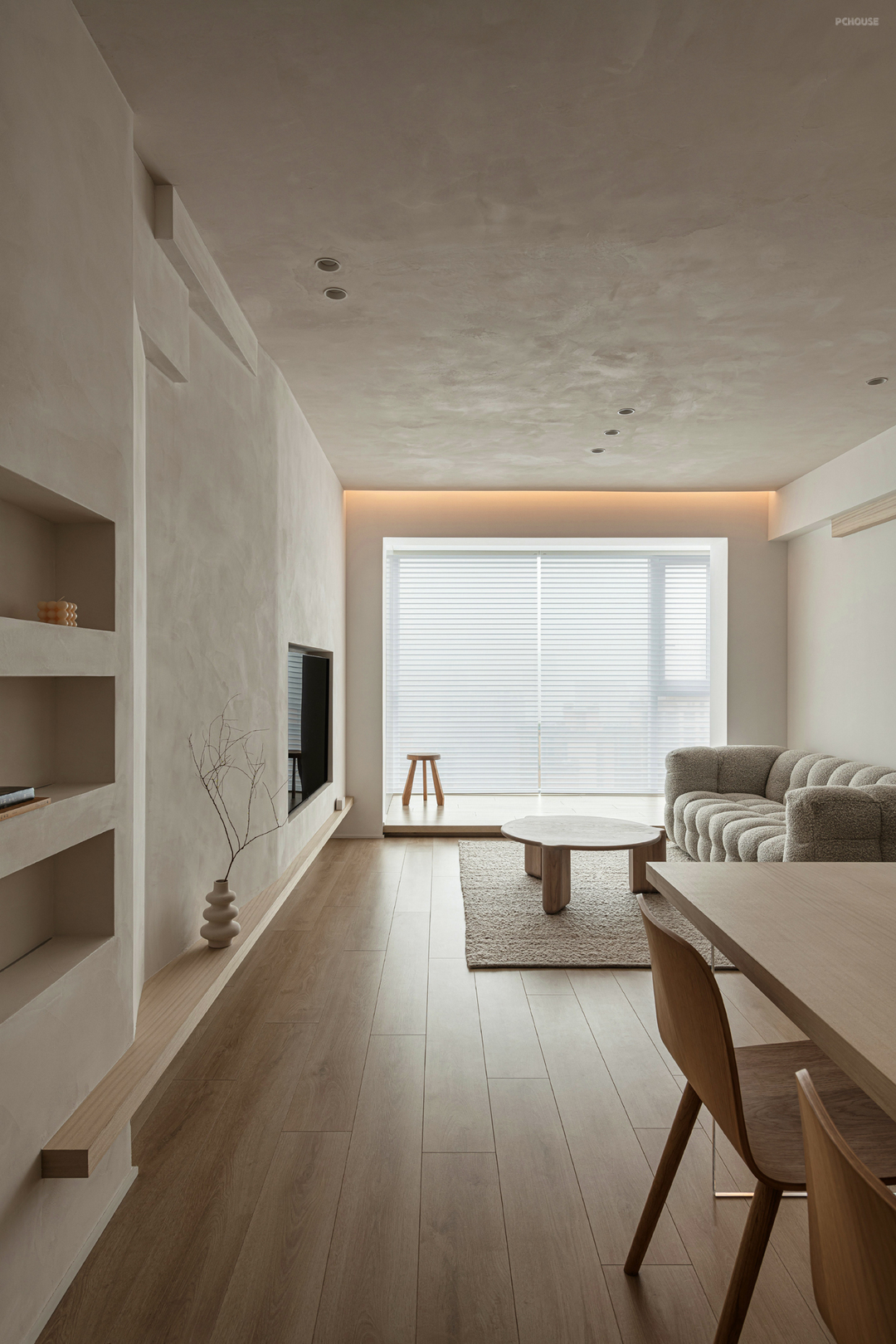
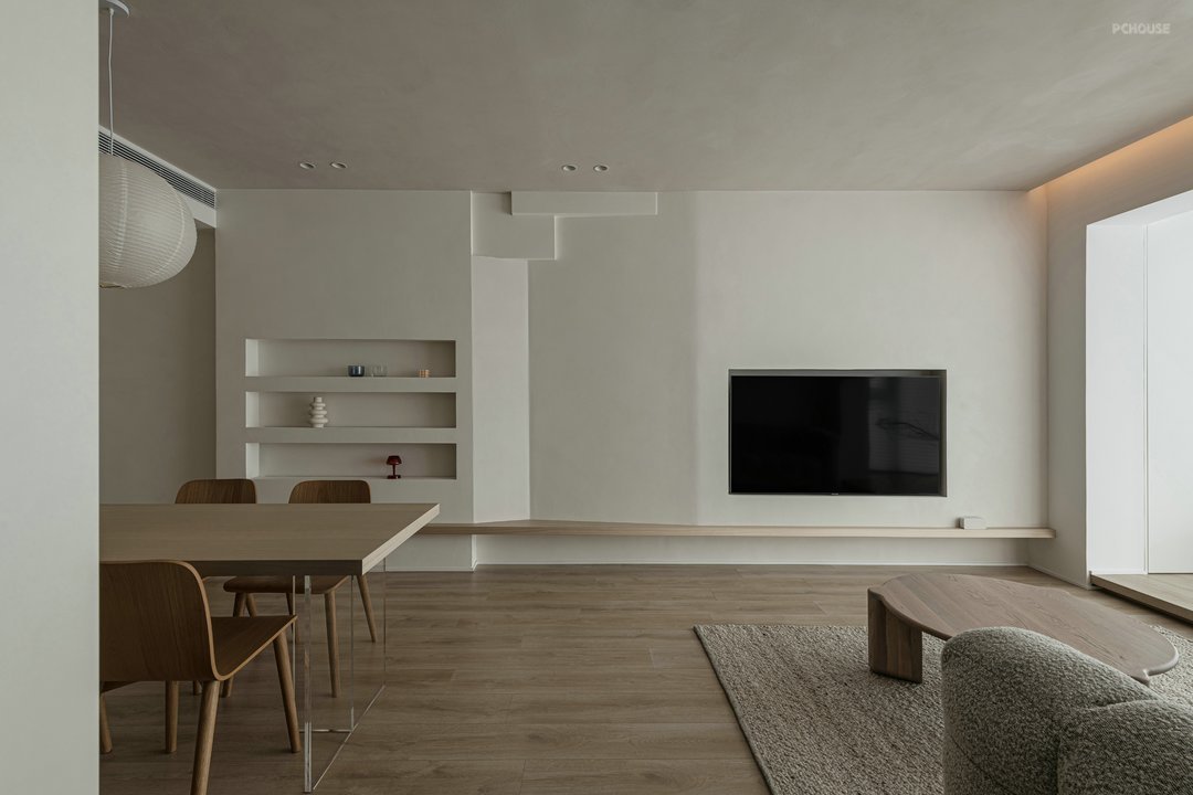
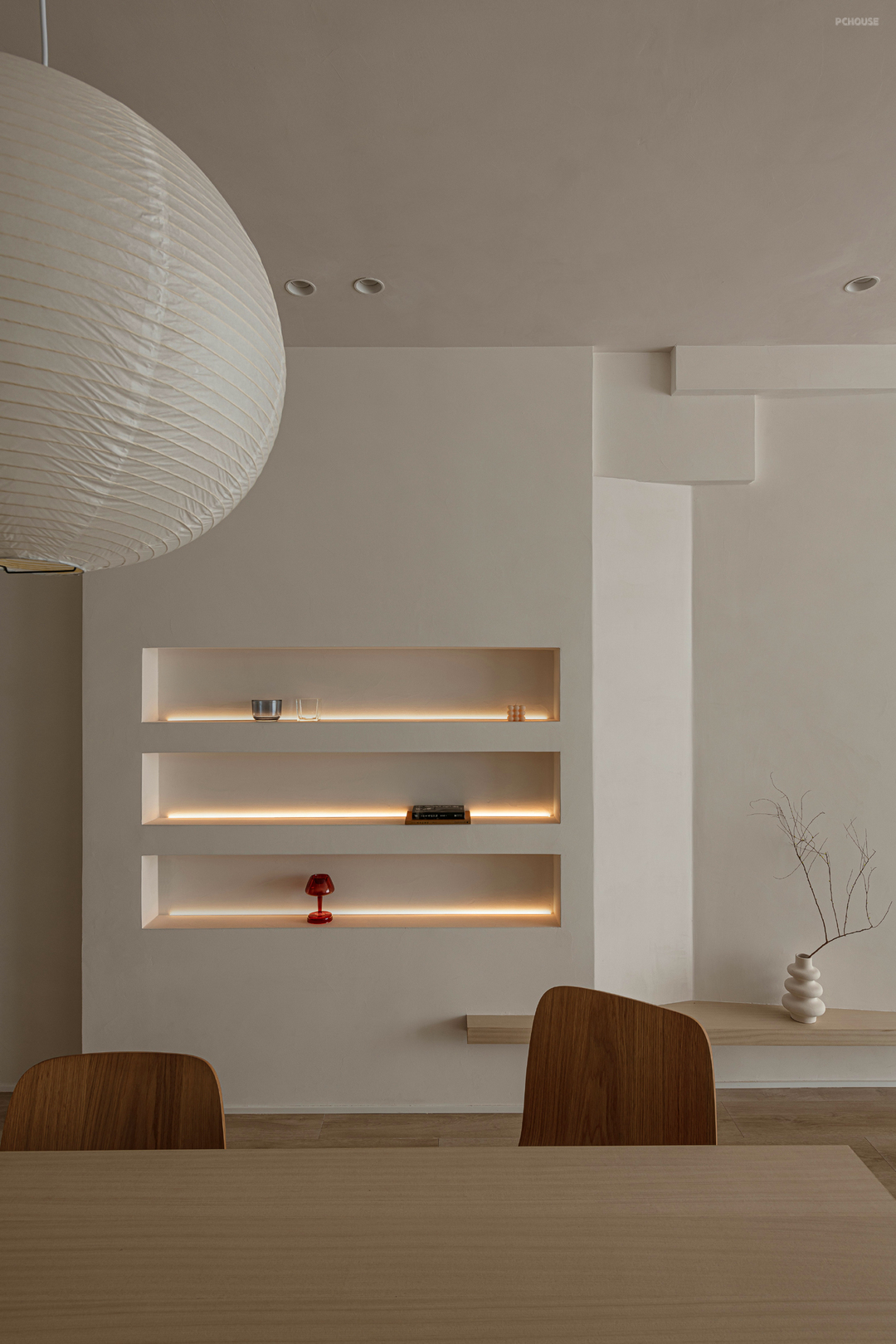
客厅整体以素雅的低饱和度色为主,布局简约轻松释放客厅空间。无主灯设计、内嵌电视墙、线条简洁的家具让整个空间流畅自由。电视墙没有做过多的造型设计,嵌入式留白电视墙用隔板与壁龛连接。连接处我们采用建筑设计手法做凹凸造型,整体又有节奏,顶面采用艺术漆,提升空间质感。LDK设计让厨房与餐厅互通、实现空间最大化利用。
The living room as a whole is dominated by simple and elegant low-saturation colors, and the layout is simple and easy to release the living room space. No main lamp design, built-in TV wall, and clean-lined furniture make the whole space smooth and free. The TV wall has not done too much modeling design, and the embedded blank TV wall is connected to the niche with a partition. We use architectural design techniques to make concave and convex shapes at the joints, and the whole has a rhythm. The top surface is made of artistic paint to enhance the texture of the space. The LDK design allows the kitchen and dining room to communicate with each other and maximize the use of space.
The living room as a whole is dominated by simple and elegant low-saturation colors, and the layout is simple and easy to release the living room space. No main lamp design, built-in TV wall, and clean-lined furniture make the whole space smooth and free. The TV wall has not done too much modeling design, and the embedded blank TV wall is connected to the niche with a partition. We use architectural design techniques to make concave and convex shapes at the joints, and the whole has a rhythm. The top surface is made of artistic paint to enhance the texture of the space. The LDK design allows the kitchen and dining room to communicate with each other and maximize the use of space.
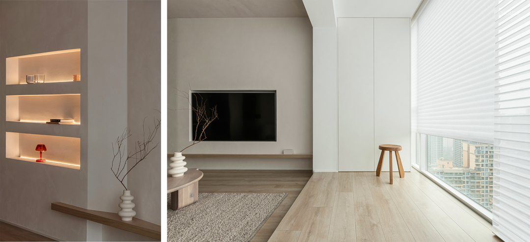

我们利用墙面凸出12cm设计了墙龛,表面采用耐擦洗微水泥涂料,放置屋主喜爱的饰品物件,墙龛内做了灯带设计,给饰品增加活力同时可作为中部光源营造空间氛围。
We designed a wall niche with a 12cm protrusion from the wall. The surface is made of scrub-resistant micro-cement paint, where the homeowner’s favorite accessories are placed. The wall niche is designed with light strips, which add vitality to the accessories and can be used as a central light source to create a space atmosphere.
We designed a wall niche with a 12cm protrusion from the wall. The surface is made of scrub-resistant micro-cement paint, where the homeowner’s favorite accessories are placed. The wall niche is designed with light strips, which add vitality to the accessories and can be used as a central light source to create a space atmosphere.


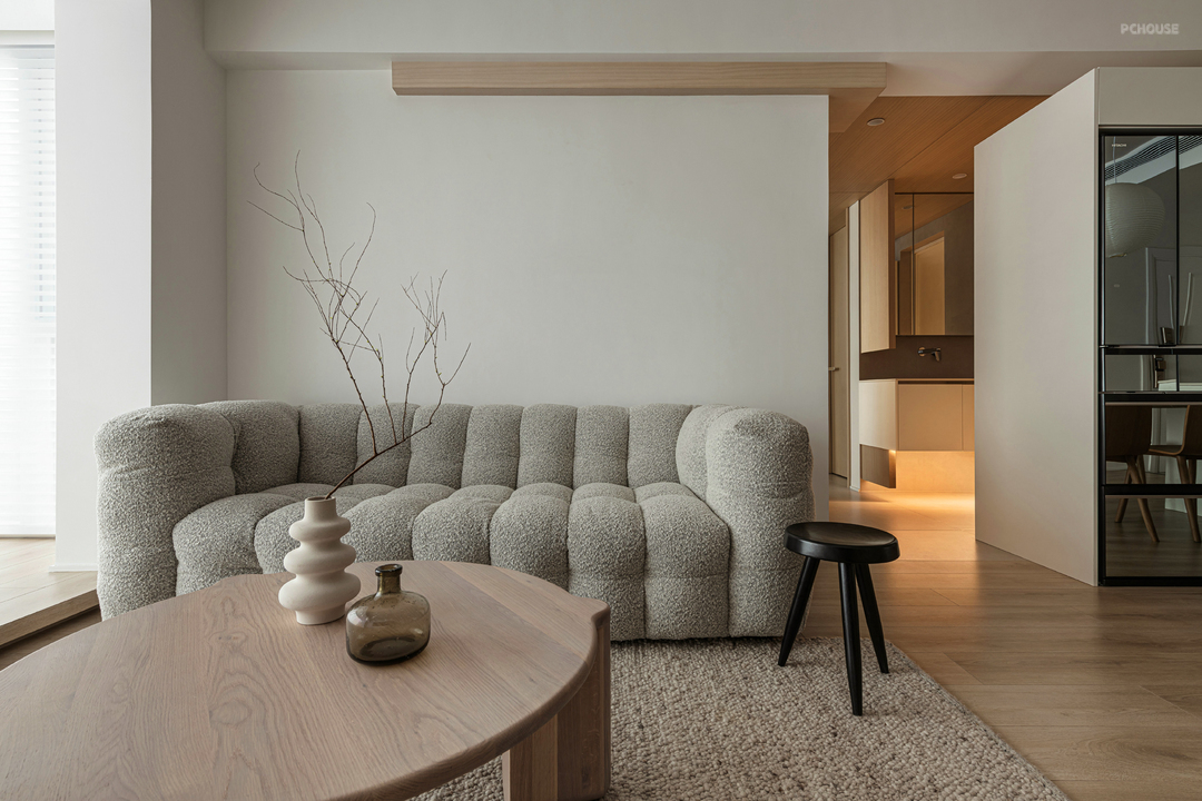
沙发墙没有设计过多的造型,选择了一个有体块感的羊羔绒沙发柔化整个客厅,既舒适又在视觉上独当一面,阳台门拆除后,阳台纳入客厅扩充客厅空间,为了满足屋主的日韩生活习惯,做了地台设计。顶面暖色灯带增加墙面层次,温馨惬意,木质地台席地而坐,看书、品茶偷得浮生半日闲……
The sofa wall is not designed with too many shapes, and a sherbet sofa with body pleasure is selected to soften the whole living room, which is both comfortable and visually independent. After the balcony door was removed, the balcony was incorporated into the living room to expand the living room space. In order to meet the Japanese and Korean living habits of the owner, a platform was designed. The warm-colored light strip on the top increases the level of the wall, making it warm and comfortable. Sitting on the wooden floor, reading books, drinking tea, and stealing a half-day leisure...
The sofa wall is not designed with too many shapes, and a sherbet sofa with body pleasure is selected to soften the whole living room, which is both comfortable and visually independent. After the balcony door was removed, the balcony was incorporated into the living room to expand the living room space. In order to meet the Japanese and Korean living habits of the owner, a platform was designed. The warm-colored light strip on the top increases the level of the wall, making it warm and comfortable. Sitting on the wooden floor, reading books, drinking tea, and stealing a half-day leisure...
· 厨房
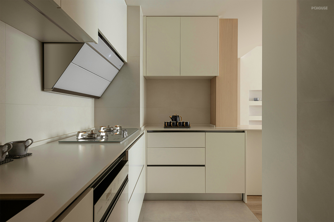
墙地面选用微水泥素色砖搭配白色亚光质感橱柜门板,无拉手设计没有突兀,让厨房显得更加质感流畅。单独的电器区域干湿分离、动线明确。
The wall and floor are made of micro-cement plain bricks with white matt textured cabinet door panels. The handle-free design is not abrupt, making the kitchen more smooth and smooth. The separate electrical area is separated from wet and dry, and the moving line is clear.
The wall and floor are made of micro-cement plain bricks with white matt textured cabinet door panels. The handle-free design is not abrupt, making the kitchen more smooth and smooth. The separate electrical area is separated from wet and dry, and the moving line is clear.
· 过道
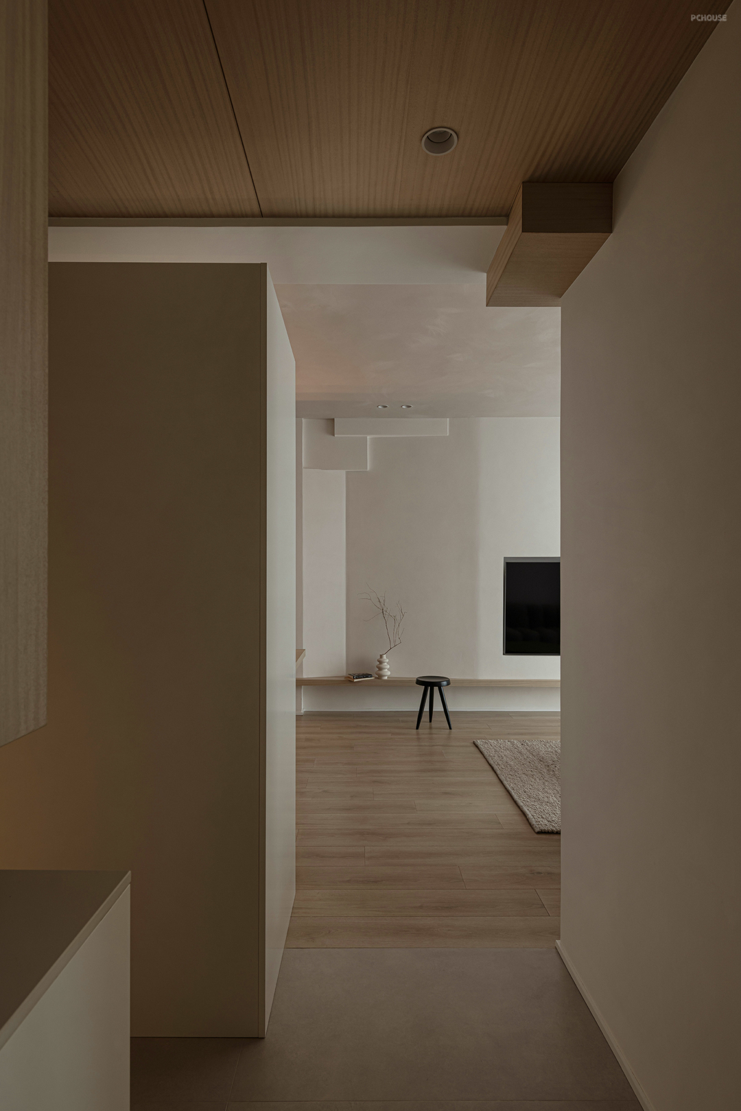
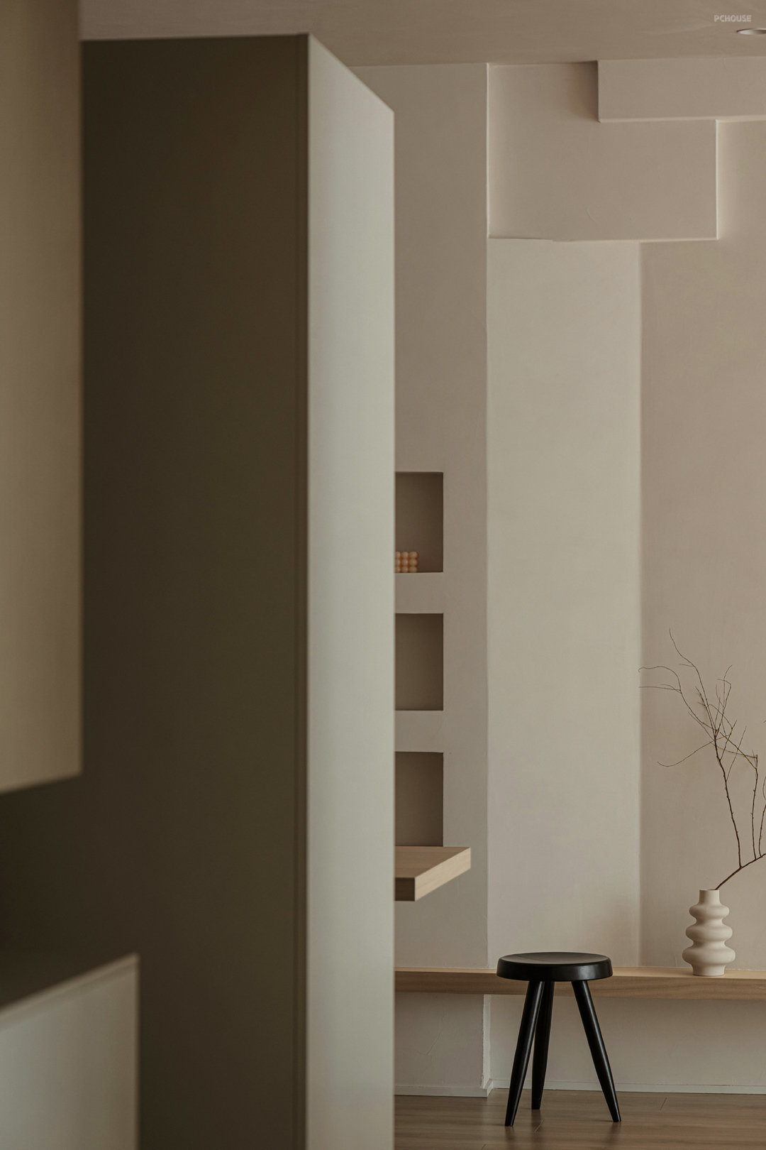
不同角度实现一步一景。
One step at a time from different angles.
One step at a time from different angles.
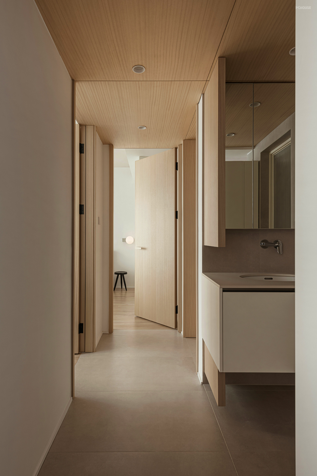
过道顶面、地面与盥洗间结合设计。视觉上扩大视野,更显宽敞。结合顶面木饰面设计到顶卧室门,去除多余线条让空间更整体。浴室柜下面设计灯带既能营造氛围又兼顾夜灯功能。
The top surface of the aisle, the floor and the toilet are combined. Visually expand the field of vision and make it more spacious. Combined with the top wood veneer design to the top bedroom door, remove redundant lines to make the space more integrated. The design of the light strip under the bathroom cabinet can not only create an atmosphere but also take into account the night light function.
The top surface of the aisle, the floor and the toilet are combined. Visually expand the field of vision and make it more spacious. Combined with the top wood veneer design to the top bedroom door, remove redundant lines to make the space more integrated. The design of the light strip under the bathroom cabinet can not only create an atmosphere but also take into account the night light function.
· 卫生间
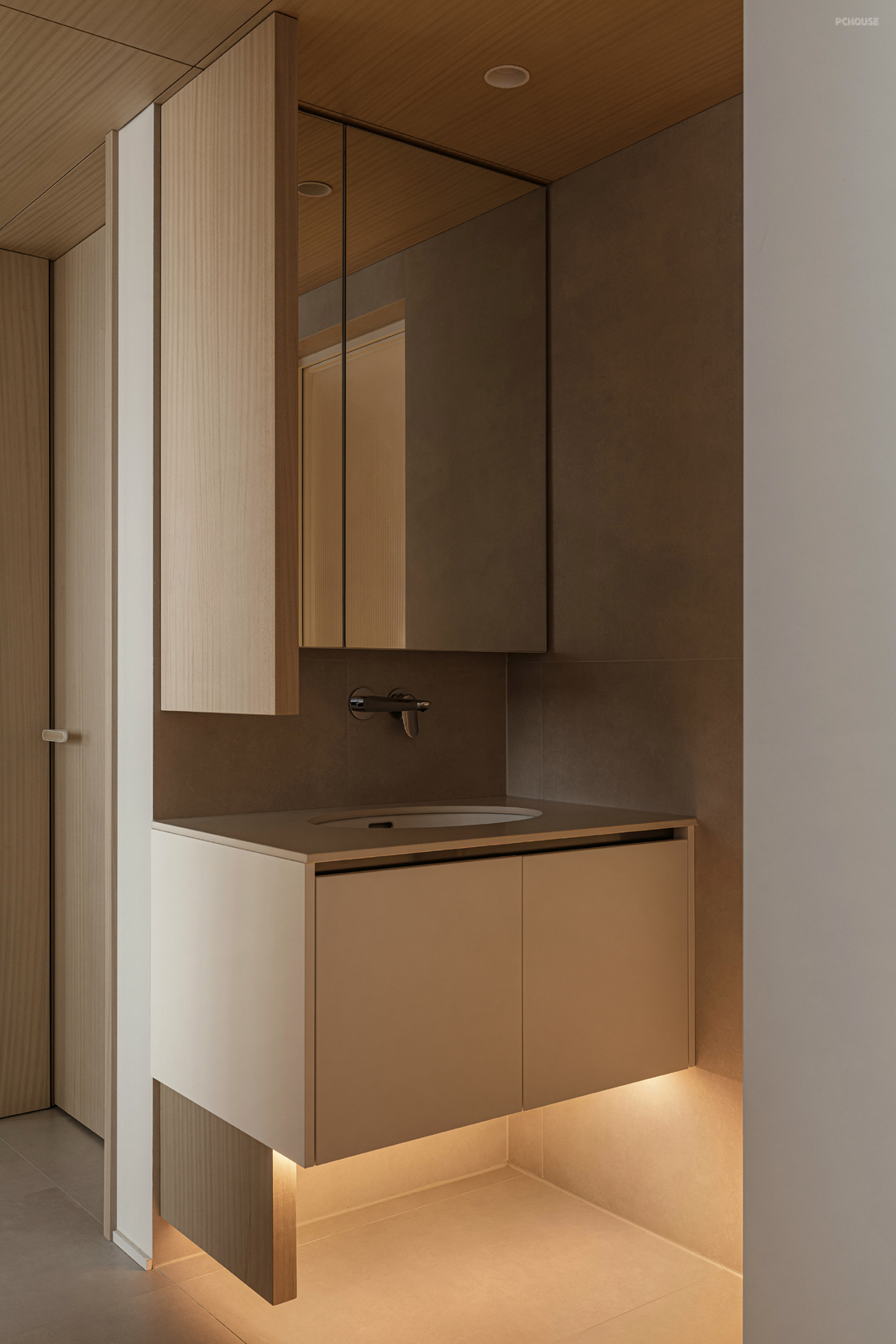
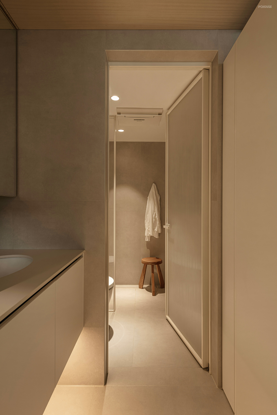
浴室柜采用方块木质盒子,悬空而置,隔而不断,既有细节又有互通,让空间宽敞又有趣味。卫生间采用微水泥质感砖,实现墙地统一,延续整体的低饱和度色调。
The bathroom cabinet is made of square wooden boxes, which are placed in the air, separated and continuous, with details and intercommunication, making the space spacious and interesting. The bathroom uses micro-cement textured bricks to achieve the unity of the walls and the floor, continuing the overall low-saturation color tone.
The bathroom cabinet is made of square wooden boxes, which are placed in the air, separated and continuous, with details and intercommunication, making the space spacious and interesting. The bathroom uses micro-cement textured bricks to achieve the unity of the walls and the floor, continuing the overall low-saturation color tone.
· 主卧

主卧面积较小,在选择家具上注重控制尺寸。没有做背景墙设计,壁灯与吊灯的组合功能与美观兼备。床头柜根据尺寸定制,满足功能又节省空间。
The master bedroom has a small area, so pay attention to controlling the size when choosing furniture. There is no background wall design, and the combination of wall lamps and chandeliers is both functional and beautiful. The bedside table can be customized according to the size to meet the function and save space.
The master bedroom has a small area, so pay attention to controlling the size when choosing furniture. There is no background wall design, and the combination of wall lamps and chandeliers is both functional and beautiful. The bedside table can be customized according to the size to meet the function and save space.
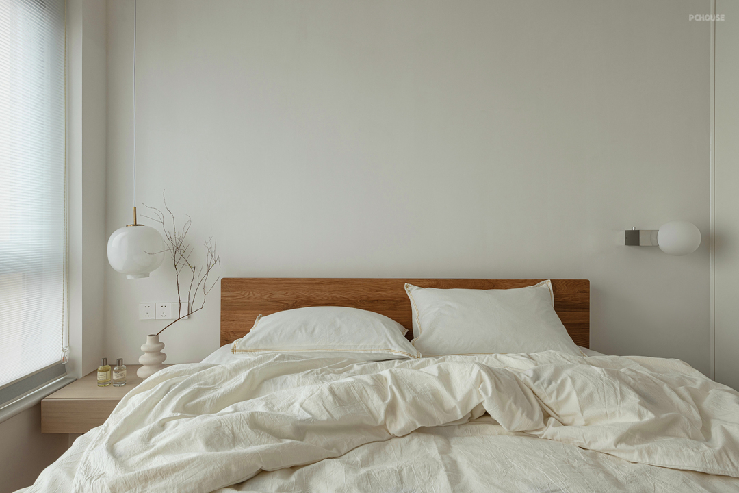

借用次卧空间增加了小型梳妆台,为了节约空间窗帘选用蜂巢帘,全遮光与半遮光任意切换。
A small dressing table is added to the second bedroom space. In order to save space, the curtains use honeycomb curtains, and the full shading and half shading can be switched arbitrarily.
A small dressing table is added to the second bedroom space. In order to save space, the curtains use honeycomb curtains, and the full shading and half shading can be switched arbitrarily.
· 书房
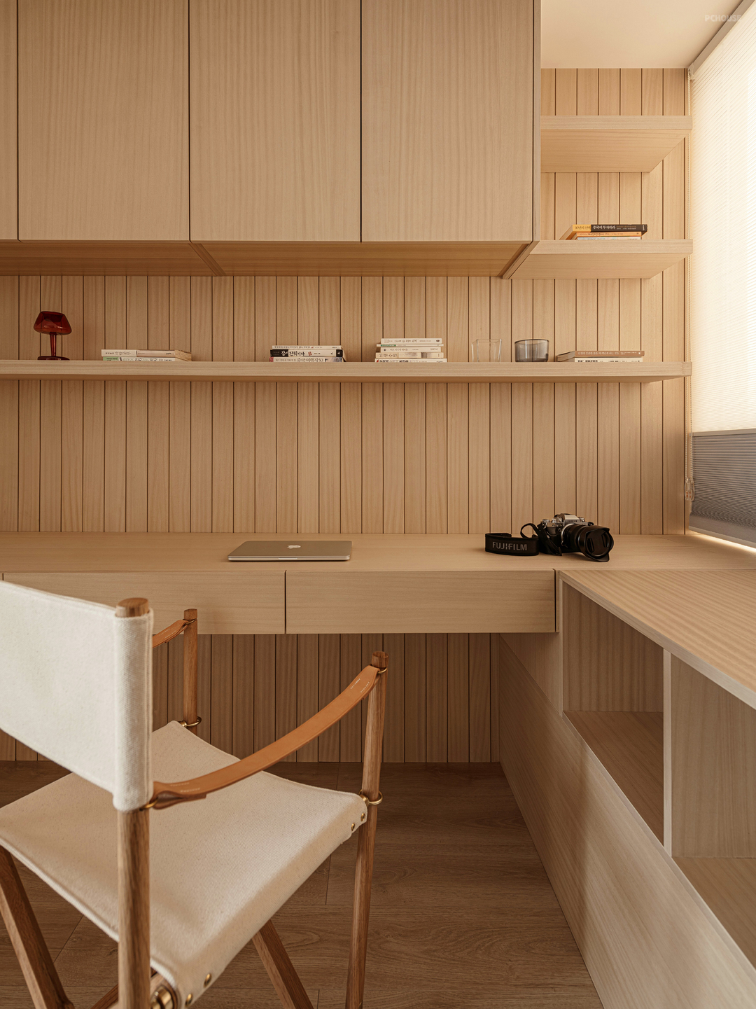
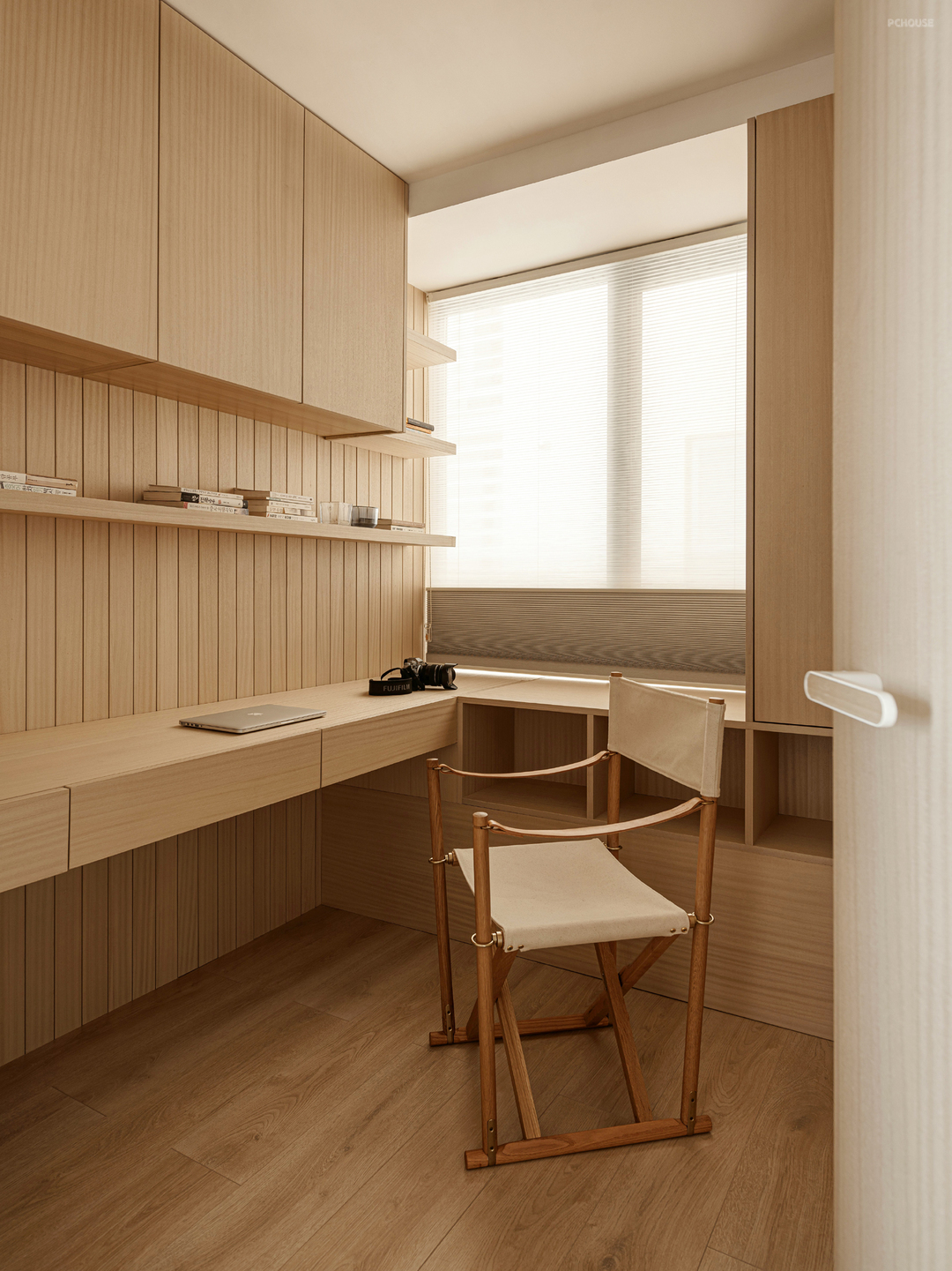
定制木质双人书桌收纳、办公共同兼顾。墙板的留缝设计让书房显得自然放松。
Customized wooden double desk storage and office work together. The seam design of the wall panels makes the study look natural and relaxed.
Customized wooden double desk storage and office work together. The seam design of the wall panels makes the study look natural and relaxed.
更多推荐
在线咨询
目录
户型图


门厅


餐厅


客厅


厨房

过道


卫生间


主卧


书房


评论 0