集间 x 精装房重塑 | 与时光为邻 . 每一帧都是生活
户型三室
面积132m²
花费50万以上
位置成都市
风格 混搭、法式、自然风
前言
日常生活和精神追求融合一体是现代人的居住理念。本案位于成都天府新区,房子主人是一对年轻夫妇,在买房后迎来了他们的小朋友,老人帮忙照顾。三代同堂住起来舒服,动线和收纳是重点。房屋原本是精装交付 ,原始装修不符合屋主喜好,更重要的是结构不合理,因此屋主决定拆了重造。
The integration of daily life and spiritual pursuit is the living concept of modern people. The case is located in Tianfu New District, Chengdu, the owner of the house is a young couple, after buying a house to welcome their children, the elderly to help take care of. The three generations live comfortably in the same room, and the moving line and storage are the key points. The house was originally delivered in hardcover, the original decoration did not meet the owner's preferences, and more importantly, the structure was unreasonable, so the owner decided to demolish and rebuild.
The integration of daily life and spiritual pursuit is the living concept of modern people. The case is located in Tianfu New District, Chengdu, the owner of the house is a young couple, after buying a house to welcome their children, the elderly to help take care of. The three generations live comfortably in the same room, and the moving line and storage are the key points. The house was originally delivered in hardcover, the original decoration did not meet the owner's preferences, and more importantly, the structure was unreasonable, so the owner decided to demolish and rebuild.
· 户型图

原始结构图

平面布置图
设计重点:
◾三代同堂需要足够多的收纳空间。
◾将门厅与次卧的墙拆掉,增加包包柜、鞋柜。
◾纳入客厅过道,扩充客厅、主卫、主卧空间。
◾去掉一个房间,纳入餐厅,设置儿童房衣柜,释放童房空间。
◾拆掉厨房与生活阳台之间的非承重墙,增加电器区域。
◾拆掉厨房和生活阳台的平开门,改为三联动推拉门,出入方便,视觉化零为整。
设计重点:
◾三代同堂需要足够多的收纳空间。
◾将门厅与次卧的墙拆掉,增加包包柜、鞋柜。
◾纳入客厅过道,扩充客厅、主卫、主卧空间。
◾去掉一个房间,纳入餐厅,设置儿童房衣柜,释放童房空间。
◾拆掉厨房与生活阳台之间的非承重墙,增加电器区域。
◾拆掉厨房和生活阳台的平开门,改为三联动推拉门,出入方便,视觉化零为整。
· 门厅

改造前的门厅

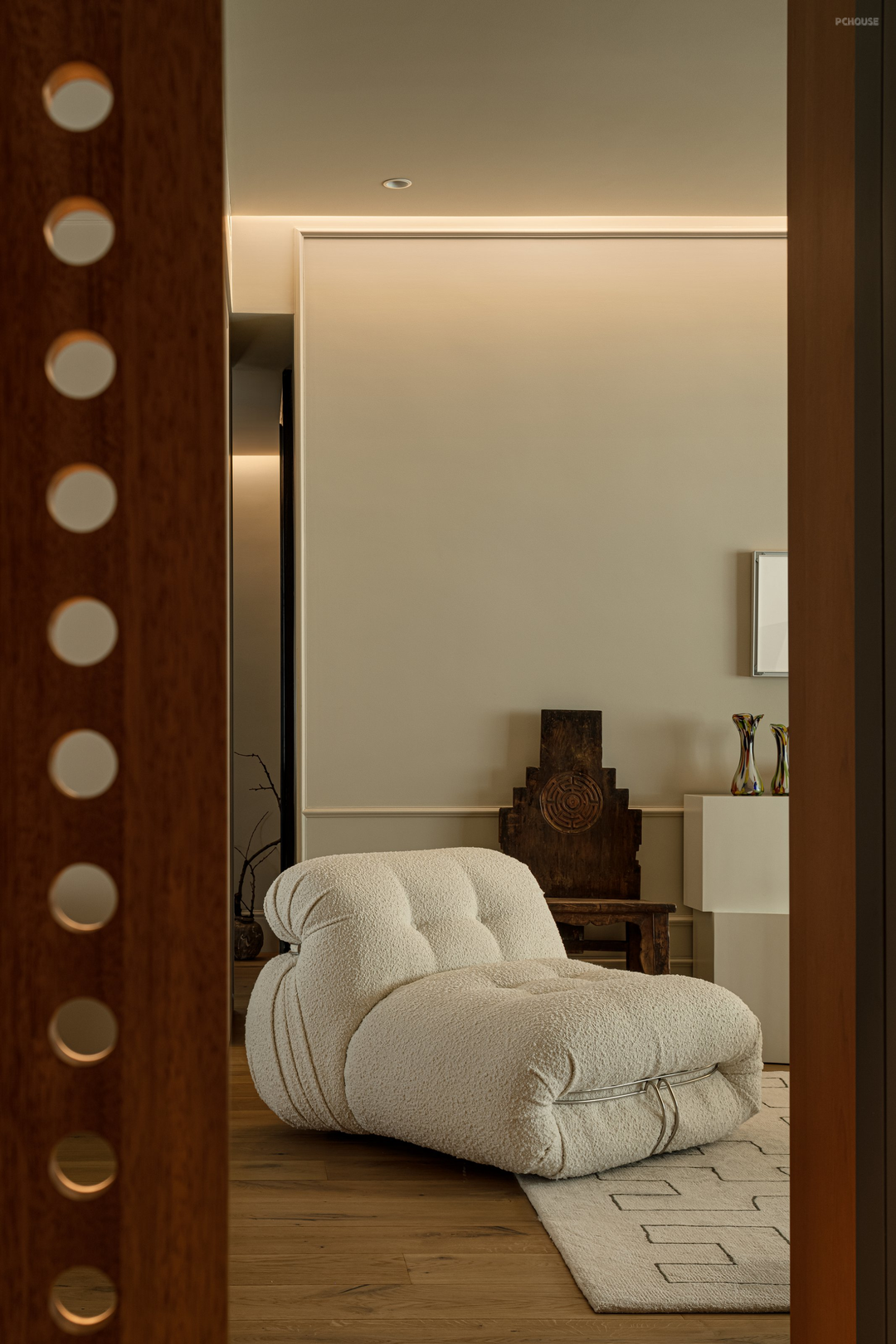

玄关是连接家内外的地方,步入家静谧的色调让人放松下来,玄关收纳关系生活的便利性,去除玄关与次卧之间的墙体增加鞋柜,外观与卧室门统一保持视觉完整,另一侧洞洞板柜门让空气流通,增加视觉元素。
The entrance is a place that connects home and outside, enters the quiet tone of the home to relax, the entrance contains the convenience of life, removes the wall between the entrance and the second bedroom to increase the shoe cabinet, the appearance is unified with the bedroom door to maintain visual integrity, and the other side of the cave cabinet door allows air circulation and increases visual elements.
The entrance is a place that connects home and outside, enters the quiet tone of the home to relax, the entrance contains the convenience of life, removes the wall between the entrance and the second bedroom to increase the shoe cabinet, the appearance is unified with the bedroom door to maintain visual integrity, and the other side of the cave cabinet door allows air circulation and increases visual elements.
· 客厅

改造前的客厅


无论从面积还是位置来说,客厅都算得上是家中的核心区域。客厅整体以浅色为主色调,搭配木质单品,平静中流露出温暖。考虑到小朋友上学后老人在家时间较长客厅保留了电视功能。
In terms of size and location, the living room is considered to be the core area of the home. The living room as a whole is dominated by light colors, with wooden pieces, showing warmth in calm. The living room retains the TV function in consideration of the fact that the old people spend more time at home after the children go to school.
In terms of size and location, the living room is considered to be the core area of the home. The living room as a whole is dominated by light colors, with wooden pieces, showing warmth in calm. The living room retains the TV function in consideration of the fact that the old people spend more time at home after the children go to school.
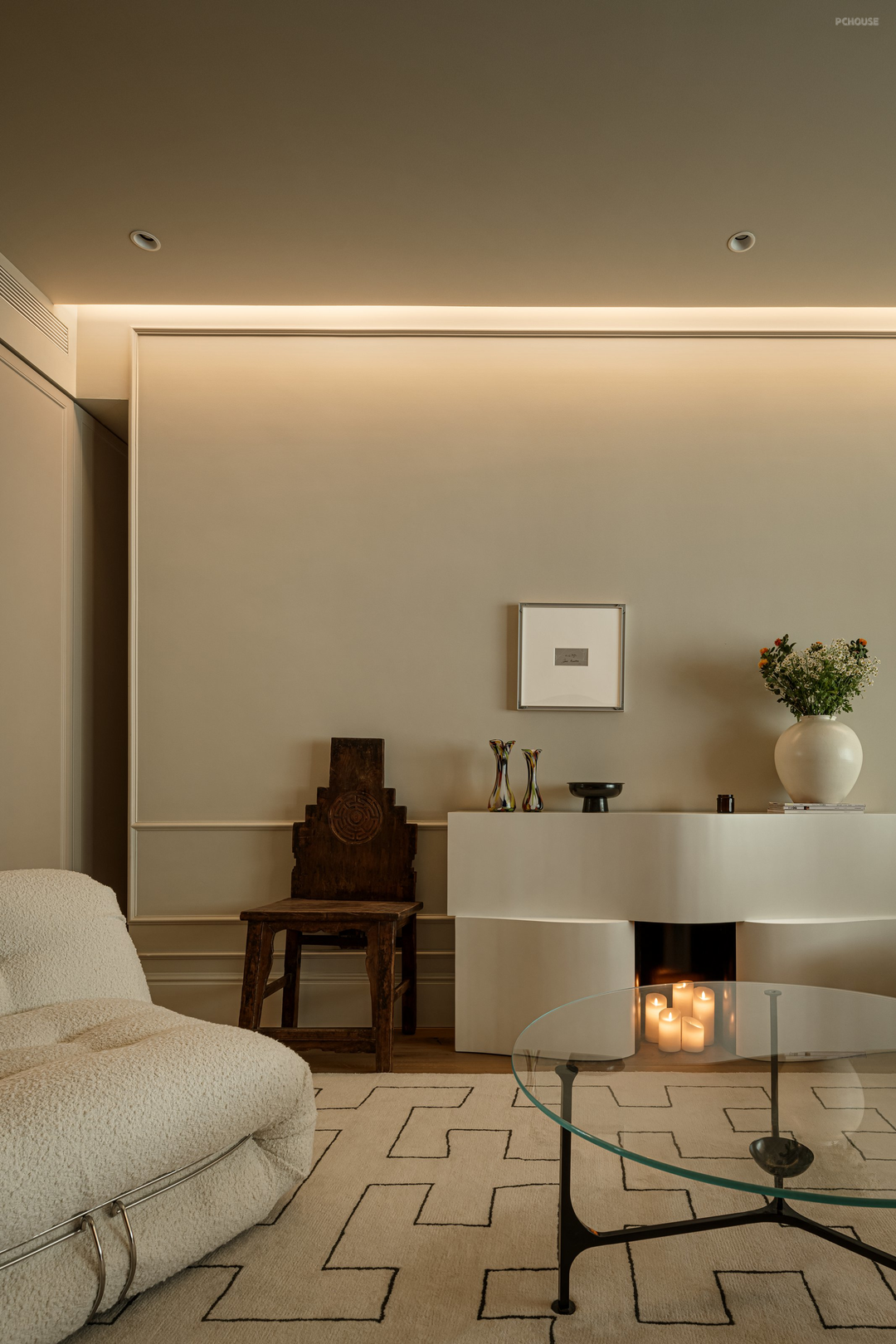

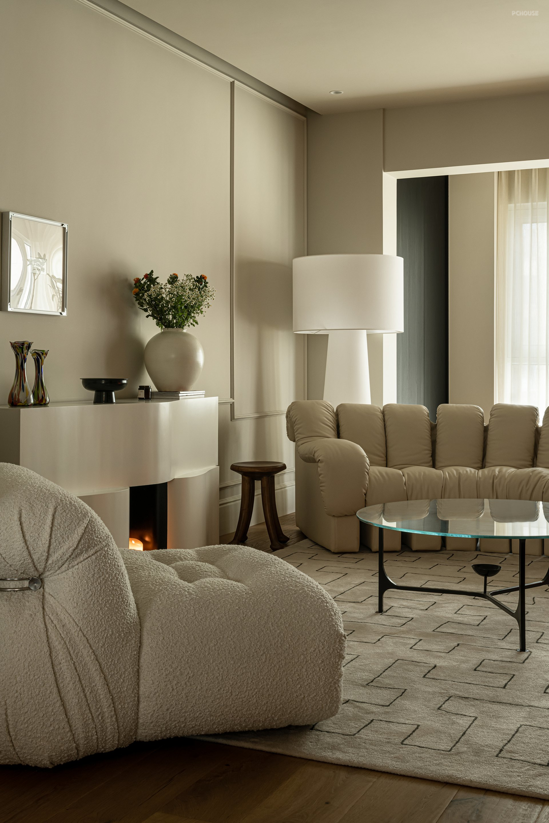

原本闲置的过道纳入客厅让客厅空间得到扩充,墙体与储物柜之间的间隔增加构成感,壁炉成为视觉聚焦点。一件老家具、新与旧的结合,耐人回味。客厅家具摆放采用围合式,家具沙发选用弧形贴合慵懒惬意的氛围,Cappellini落地灯补充中部光源,增加客厅氛围。
The living room furniture is placed in a enclosing style, the furniture sofa is curved to fit the lazy and comfortable atmosphere, and the Cappellini floor lamp supplements the central light source to increase the living room atmosphere.The living room is expanded by incorporating an otherwise idle hallway into the living room, the gap between the wall and the locker adds a sense of composition, and the fireplace becomes a visual focal point. A piece of old furniture, the combination of new and old, enduring aftertaste.
The living room furniture is placed in a enclosing style, the furniture sofa is curved to fit the lazy and comfortable atmosphere, and the Cappellini floor lamp supplements the central light source to increase the living room atmosphere.The living room is expanded by incorporating an otherwise idle hallway into the living room, the gap between the wall and the locker adds a sense of composition, and the fireplace becomes a visual focal point. A piece of old furniture, the combination of new and old, enduring aftertaste.
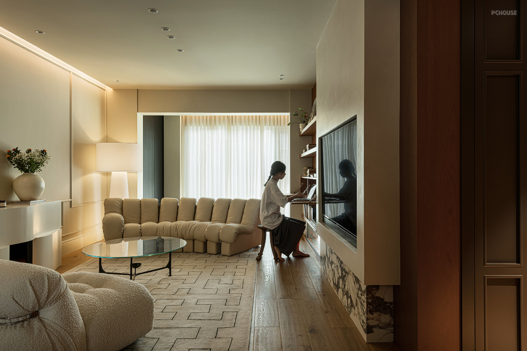

屋主希望这套房保留以前住过的每套房客厅有书柜的特点,樱桃木书柜兼书桌功能,满足多种生活场景切换,可工作、可躺、也能无所事事地四处游走......
The owner hopes that this suite will retain the features of the bookcase in the living room of every suite he has lived in before. The cherry wood bookcase and desk function can meet a variety of life scenes to switch, you can work, lie down, or walk around idly......
The owner hopes that this suite will retain the features of the bookcase in the living room of every suite he has lived in before. The cherry wood bookcase and desk function can meet a variety of life scenes to switch, you can work, lie down, or walk around idly......

利用客厅原本打不掉的承重墙设置储物柜。外观选用与墙面接近色,简洁的线条恬静、不张扬更好的融入空间。
Use the unbreakable load-bearing wall in the living room to set up lockers. The appearance is close to the color of the wall, and the simple lines are quiet and quiet, and the space is better integrated without publicity.
Use the unbreakable load-bearing wall in the living room to set up lockers. The appearance is close to the color of the wall, and the simple lines are quiet and quiet, and the space is better integrated without publicity.
· 餐厅

改造前的餐厅


屋主说原始餐厅是最不能接受的一个地方,餐桌无法正常摆放、厨房和生活阳台两个小门让空间显得十分逼仄。设计师纳入一部分书房空间给餐厅,改造后的餐厅可以放置2M餐桌,满足三代人用的需求。
The owner said the original dining room was one of the most unacceptable places, with tables not properly arranged and two small doors to the kitchen and living balcony making the space very cramped. The designer includes part of the study space for the dining room, and the renovated dining room can place 2M tables to meet the needs of three generations.
The owner said the original dining room was one of the most unacceptable places, with tables not properly arranged and two small doors to the kitchen and living balcony making the space very cramped. The designer includes part of the study space for the dining room, and the renovated dining room can place 2M tables to meet the needs of three generations.

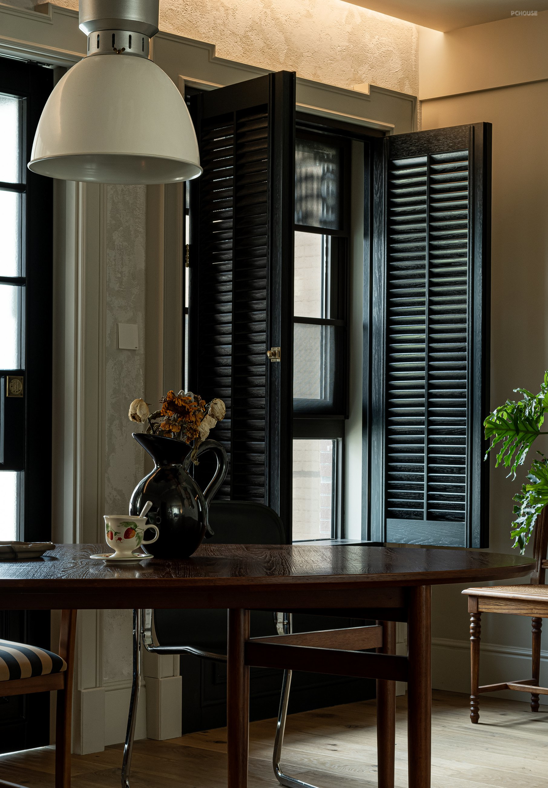

餐厅墙面采用化零为整的手法,拉伸餐厅视觉。黑色门、百叶窗与浅色艺术漆在灯光的营造下成为家里的视觉聚焦点。
The restaurant wall adopts the method of integrating parts and pieces to stretch the restaurant vision. Black doors, shutters and light art paint create a visual focal point in the home.
The restaurant wall adopts the method of integrating parts and pieces to stretch the restaurant vision. Black doors, shutters and light art paint create a visual focal point in the home.


三联动推拉门让厨房、生活阳台通行更流畅,透过玻璃人影流动,串联起家的生活画面。
Three linkage sliding doors make the kitchen and living balcony pass more smoothly, flow through the glass figure, and connect the life picture of the beginning.
Three linkage sliding doors make the kitchen and living balcony pass more smoothly, flow through the glass figure, and connect the life picture of the beginning.


利用承重墙的位置设置餐边柜,满足日常茶水功能,金属材质作为背景增添空间质感。公区与卧室之间采用去过道化设计,狭长的过道不仅浪费空间还视觉枯,经过设计师梳理后过渡自然且实现一步一景。平常的日子,木材与植物营造出一方惬意天地,黑色的百叶窗内敛成稳的衬托着整个空间。
The side cabinet is set up at the position of the load-bearing wall to meet the daily tea function, and the metal material is used as the background to add space texture. The hallway design is adopted between the public area and the bedroom. The narrow and long aisle is not only a waste of space but also a visual waster. After the designer combs, the transition is natural and the scenery is realized step by step. On normal days, wood and plants create a pleasant world, and the black shutters are closed to form a stable backdrop to the entire space.
The side cabinet is set up at the position of the load-bearing wall to meet the daily tea function, and the metal material is used as the background to add space texture. The hallway design is adopted between the public area and the bedroom. The narrow and long aisle is not only a waste of space but also a visual waster. After the designer combs, the transition is natural and the scenery is realized step by step. On normal days, wood and plants create a pleasant world, and the black shutters are closed to form a stable backdrop to the entire space.
· 厨房
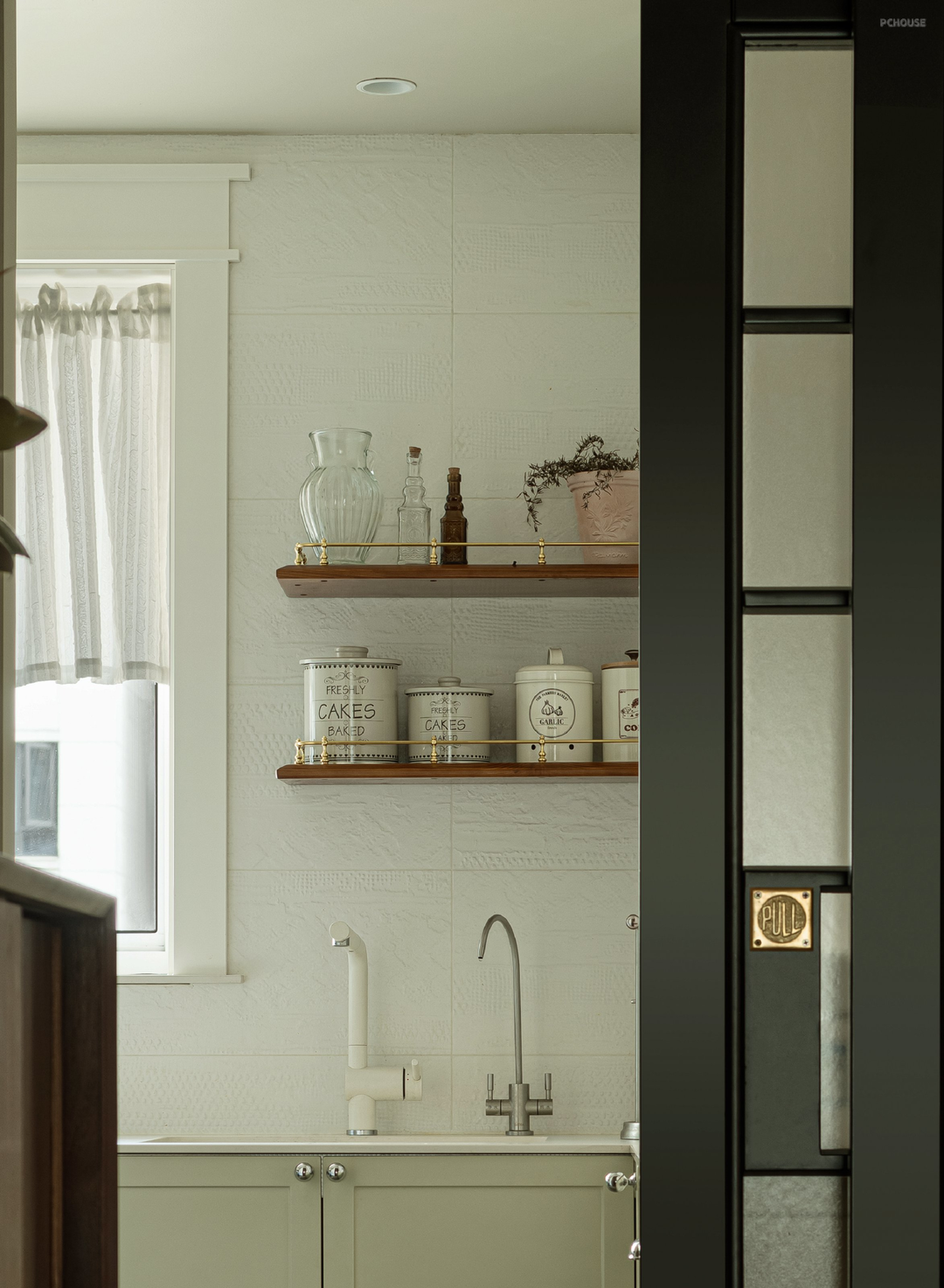


一饮一食包裹着平凡日子里的无尽欢喜,每天使用频率很高的厨房屋主希望整体氛围是清爽的,可拆洗窗帘、暖色吊灯,让厨房有了独特调性。
A drink and a meal are wrapped in the endless joy of ordinary days, and the owners of the kitchen with a high frequency of use every day hope that the overall atmosphere is refreshing, and the curtains and warm chandeliers can be dismantled and washed, so that the kitchen has a unique tone.
A drink and a meal are wrapped in the endless joy of ordinary days, and the owners of the kitchen with a high frequency of use every day hope that the overall atmosphere is refreshing, and the curtains and warm chandeliers can be dismantled and washed, so that the kitchen has a unique tone.
· 卫生间

卫生间做了干湿分离,整体色调素净雅致,便于日常打理。
The bathroom is dry and wet separation, the overall tone is plain and elegant, easy to take care of daily.
The bathroom is dry and wet separation, the overall tone is plain and elegant, easy to take care of daily.
· 主卧

改造前的主卧


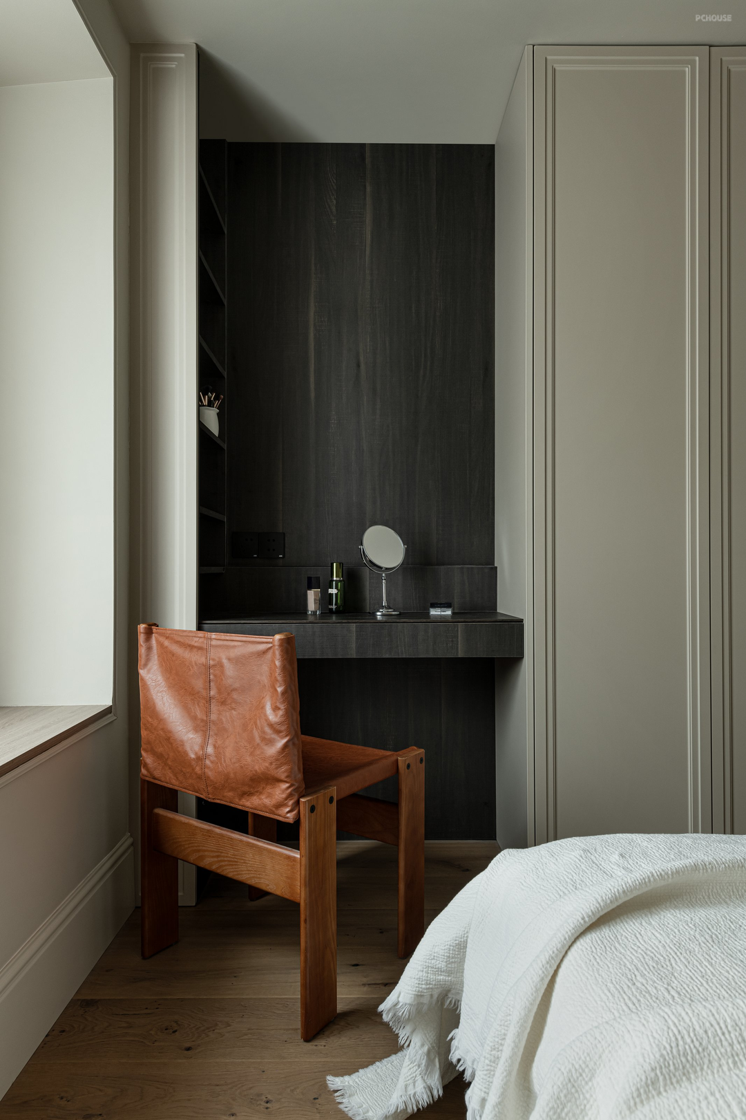
安静、温馨是休憩场所该具备的特点,主卧以柔和的中性色调为主,无过多装饰。光源上采用低位、中位、高位光源结合,满足不同亮度切换。
Quiet and warm are the characteristics of the rest place, and the master bedroom is mainly in soft neutral colors without too much decoration. The light source adopts the combination of low, middle and high light source to meet the different brightness switching.
Quiet and warm are the characteristics of the rest place, and the master bedroom is mainly in soft neutral colors without too much decoration. The light source adopts the combination of low, middle and high light source to meet the different brightness switching.
· 小孩房

儿童房整体配色温馨,家具灵活布置,满足不同时期成长需求。
The overall color of the children's room is warm, and the furniture is flexibly arranged to meet the growth needs of different periods.
The overall color of the children's room is warm, and the furniture is flexibly arranged to meet the growth needs of different periods.
· 次卧

次卧以功能为主,舒适的床品营造休息氛围。
The second bedroom is mainly functional, and the comfortable bed creates a rest atmosphere.
The second bedroom is mainly functional, and the comfortable bed creates a rest atmosphere.
更多推荐
在线咨询
目录
户型图


门厅


客厅


餐厅


厨房


卫生间

主卧


小孩房

次卧


评论 0